Tuesday, 13 March 2012
Devil
My inspiration for this piece of work is a mixture of scenes i have found other artists do of the end of the world and the Jurassic park series where the the dinosaurs come out of the eggs.I am very proud of this piece of work as it is the first time that I have combined several layers and created my own scene from things that most would not even think would be in this image such as the die that is used for the the "egg". I used the die because it strayed away from the Clea Shae of the roundness and the soft affect it give and this cube shows a different thine coming and the end is possibly near. There will be a series of photos of all the layers of this image so you can see which are connect to which .
Friday, 2 March 2012
Apple
This image was a misstake to be honest but it has turned out to be very good one. Even thought this image is only constructed of two layers it seems tohave a lot of depth to me as the texture on the apple is very hard to work out what it is. This is simply an overlayed image on the apple. I will let you work out what it is. To add the affect of the 3D image i have dodged and burned some parts of the image in.
Tuesday, 28 February 2012
The Bike collage
Looking at some other peoples work in an exhibition at college I decided to take a little piece from a couple of their shows and see what they look like when they are all put together. These are: Textures (seat and wood), The block colouring(building) and the real image in the back ground. Starting from a tracing I had taken of the bike I then took some time rubbing our as much of the free space in it that i could. After this I started to block colour the bike and add in the textures and photos.I think that this image colour work very well if i had spent more time on it but this was just to see what would happen if I did do it. I think that the the textures and other element are good by themselves and in moderation but in this piece I have used them all to much making it look very shoddy and well,crap.
Monday, 27 February 2012
Yuuki
When in photoshop i am always trying to get good texture with my images and i have tried different techniques to get is very vivid. When I drawing and scanning I feel this give a very good texture with the smudging. This type of affect really works well with the theme of the image. When looking at this image to make it better next time I would make the drawing more affective with more detail as it is really only an outline so you can see the back brushes which is good but not very realistic. When doing this image is thought for a while what the colour scheme was going to be and I found that a red to grey gradient was the best affect as red is the colour on the Japanese flag.
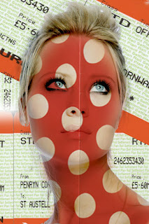
Spotted

Looking at some of Sarah Howells work of models faces with different textured scanned in. I decided to use a red spotted hanky cover this works in a very retro environment. With there market in train tickets i decided to stick with that theme. This images manipulation in not really for any message just another way to show how peoples features can be changed by using different patterns and layers. I think that this colour scheme works well as it all interlocks with the tickets in the background. To make this better next time I will make the opasity of the pattern layer a little higher to make it a little more bold on the models face.
Friday, 24 February 2012
Fraction
This image is ment to be Dan being fractionised into tiny pieces I feel that this has only worked to a mid level because of the the almost white band down his back but with working on this for a little more time will sort this out.
Subscribe to:
Posts (Atom)