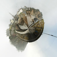
 This first image that I have chosen is of my local town in a mini world which to me add a god like theme to the photograph as my local world is in my hands. This image also shows that I am thinking about the way i am showing a normal 360 degree image. I think that this piece works really well as the pieces that stick out in the world to add further irregularity. I also feel that the image makes the viewer look around the whole image as there are so many little details in the image. This is good for my work as it give the viewers a chance to take what they would like from the image. I really like this image as it shows what most people in my local town in a new light. With my work I always try to be different and this piece of works defiantly shows that.
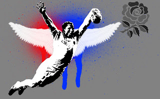
 My second image image is one of the first images I created on this project and it turns out it is one of the best ones, certainly in my book that I have ever done. The reasons behind me choosing this image is mainly because on the original image I have used. The image of Chris Ashton swallow diving in the world cup is an image that made the whole of the rugby community laugh. I also feel that in this image I have shown almost all the different things that are used in photoshop on a daily basis. On two layers I have used brushes to add a little joke or fantasy to the decisive moment . This image to me shows the new generation of rugby that is proud to score for their nation and isn't scared to show it. This is also reflected in the almost graffiti style that is used to illustrate the significant moment that occurred.
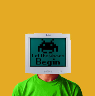
 My third and final image I have selected is one that shows a very retro feel which I enjoy show much to look at and recreate in my own image. This particular image was only to get me to grips with the simple aspects of photoshop.When creating this image it was just one thing leading to another and it has come up trumps. Although the technical aspects are not of the standers of some of my later images the simplicity in this photo really makes it more believable.There are some pieces of this image I really do not like as it is not very good in the accuracy. This is shown around the edge of the shirt because I used the colour replacement tool and done it free hand with a guidelines making this scruffy. I have chosen to use this as my printed image because I feel that it really represents me and my work in the right way and the clashing in colours really catches the viewers eye.
No comments:
Post a Comment