As part of my coursework I am producing a final evaluation on this project. This will include the things I have learned on this project, what I enjoyed about it and what I did not.
This image manipulation project has taught my me a lot about how much work goes into an in post production just to make it look real. I have also found out that some people don't want their images to look realistic they would rather it be a collage of image and drawing together. These two different types of manipulation both made me learn more about photoshop and what exactly it can do which seems to be endless at this point in time. I have also made sure that I am more focused in my work for this project and keeping myself on track. This is is because I felt this writing on a blog is more of a new age thing to do as it is fun like networking.
The things I have enjoyed most about this project is that there are really no boundaries with what you can try and there is no right or wrong thing to do. This with the ease of using the blog to record all of my work makes it more fun to do as to me writing in a book is to long winded than just signing in online and typing away to what ideas come out of my mind. Another thing which i enjoyed about this project is the type of things that can be incorporated into then project like drawing and scanning. These can make or break an image made on photoshop for me now where as before I did not know it was even done.
There are not many things that I did not enjoy about this project but one of these was, selecting what work that i had to pick to place in my finals(portfolio). This was hard because when I assess my own work I know where things are placed in using brushes and thing makes it so obvious to me making me spend more time on something which to someone else looks good but to me looks below average.
Thursday, 29 March 2012
Tuesday, 27 March 2012
My Finals
For my final hand in I am required to choose three finals from all the work I have produced throughout this project. In this post will show my three finals I have chosen and why I feel they best portray my best work in this project.
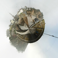 This first image that I have chosen is of my local town in a mini world which to me add a god like theme to the photograph as my local world is in my hands. This image also shows that I am thinking about the way i am showing a normal 360 degree image. I think that this piece works really well as the pieces that stick out in the world to add further irregularity. I also feel that the image makes the viewer look around the whole image as there are so many little details in the image. This is good for my work as it give the viewers a chance to take what they would like from the image. I really like this image as it shows what most people in my local town in a new light. With my work I always try to be different and this piece of works defiantly shows that.
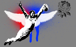 My second image image is one of the first images I created on this project and it turns out it is one of the best ones, certainly in my book that I have ever done. The reasons behind me choosing this image is mainly because on the original image I have used. The image of Chris Ashton swallow diving in the world cup is an image that made the whole of the rugby community laugh. I also feel that in this image I have shown almost all the different things that are used in photoshop on a daily basis. On two layers I have used brushes to add a little joke or fantasy to the decisive moment . This image to me shows the new generation of rugby that is proud to score for their nation and isn't scared to show it. This is also reflected in the almost graffiti style that is used to illustrate the significant moment that occurred.
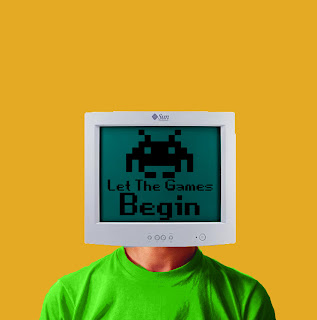 My third and final image I have selected is one that shows a very retro feel which I enjoy show much to look at and recreate in my own image. This particular image was only to get me to grips with the simple aspects of photoshop.When creating this image it was just one thing leading to another and it has come up trumps. Although the technical aspects are not of the standers of some of my later images the simplicity in this photo really makes it more believable.There are some pieces of this image I really do not like as it is not very good in the accuracy. This is shown around the edge of the shirt because I used the colour replacement tool and done it free hand with a guidelines making this scruffy. I have chosen to use this as my printed image because I feel that it really represents me and my work in the right way and the clashing in colours really catches the viewers eye.
 This first image that I have chosen is of my local town in a mini world which to me add a god like theme to the photograph as my local world is in my hands. This image also shows that I am thinking about the way i am showing a normal 360 degree image. I think that this piece works really well as the pieces that stick out in the world to add further irregularity. I also feel that the image makes the viewer look around the whole image as there are so many little details in the image. This is good for my work as it give the viewers a chance to take what they would like from the image. I really like this image as it shows what most people in my local town in a new light. With my work I always try to be different and this piece of works defiantly shows that.
 My second image image is one of the first images I created on this project and it turns out it is one of the best ones, certainly in my book that I have ever done. The reasons behind me choosing this image is mainly because on the original image I have used. The image of Chris Ashton swallow diving in the world cup is an image that made the whole of the rugby community laugh. I also feel that in this image I have shown almost all the different things that are used in photoshop on a daily basis. On two layers I have used brushes to add a little joke or fantasy to the decisive moment . This image to me shows the new generation of rugby that is proud to score for their nation and isn't scared to show it. This is also reflected in the almost graffiti style that is used to illustrate the significant moment that occurred.
 My third and final image I have selected is one that shows a very retro feel which I enjoy show much to look at and recreate in my own image. This particular image was only to get me to grips with the simple aspects of photoshop.When creating this image it was just one thing leading to another and it has come up trumps. Although the technical aspects are not of the standers of some of my later images the simplicity in this photo really makes it more believable.There are some pieces of this image I really do not like as it is not very good in the accuracy. This is shown around the edge of the shirt because I used the colour replacement tool and done it free hand with a guidelines making this scruffy. I have chosen to use this as my printed image because I feel that it really represents me and my work in the right way and the clashing in colours really catches the viewers eye.
 Friday, 23 March 2012
Digital blow
Inspired by the boarderland game cover i wanted to see if i could have the same concept of a person blowing their head out with a massive effect. When doing this I wanted to put a little piece of me into the mood so I wanted to add some digital fragments. I really do not like the way this has come out thought despite what other people say i feel that the hair i have added in looks terrible but i can not do much better at this current moment as i do not know how to create brushes if i could find a brush with a big enough span I would be motivated to do another try at this because this would make it more cartoon styled.
Force Explosion

I have always wonderd why the clouds tool was ever put in photoshop but with a little searching and tips from illistrators i realised that when using the clouds in a multibled layer and pushing them all the the edge then you create a blast affect. From watching a movie i saw a scene where the main character had this explosion so i wanted to use these skilled i learnd and put them to effect.I fill that this piece of work has worked really well in a technical aspect and a learning curve. I have now realised that photoshop takes alot of time to do anything.
Thursday, 22 March 2012
Tim Tadder
This image is by the artist Tim Tadder who is acturly reconmented by Adobe in photoshop skills. Most of Tims work is not acturly of this style but this inpoticurler image was from a cluster of images that he created to show adobe that he could use thier software with a very high standerd finshed. I feel this image is very well thought out in the compostition and the colours used. For example if this image was on a lighter background then the purple powder which I think has been created in Illistrator would not have the same effect as noone would be able to see each particle.As I said before this is not the typical work of Tim as you will see on his website a link will be placed under research at the bottom of the page. I like this piece of work as it really fits with the stereotypical colours of the dancing community and the way that the powder has been placed in a way that shows the compliment of the dancer and hiding the not so good bits.
Monday, 19 March 2012
Paint Transfers
For some experimenting I done some paint transfers to see if i could make a photo change through putting a tint onto it. I wanted to see if this would work with a surf theme this tied in with my book project as well for i was hitting two birds with one stone. This has turned out very well in giving a surf shot that I have found on the Internet in a yellow surf retro effect. I would very much consider using these for a first image in a photoshop creation as this would set a good surf mood.
Friday, 16 March 2012
Paromrama to Mini World
When walking down the street I came across a mini world for a laptop advert and i wondered how to they made it and after finding a tool called polar coordinates in the filter drop down it created my own world. This piece of work can be very inparticular to one person as it could be made for a person in their special place and it can mean something personal to them.
Tuesday, 13 March 2012
Devil
My inspiration for this piece of work is a mixture of scenes i have found other artists do of the end of the world and the Jurassic park series where the the dinosaurs come out of the eggs.I am very proud of this piece of work as it is the first time that I have combined several layers and created my own scene from things that most would not even think would be in this image such as the die that is used for the the "egg". I used the die because it strayed away from the Clea Shae of the roundness and the soft affect it give and this cube shows a different thine coming and the end is possibly near. There will be a series of photos of all the layers of this image so you can see which are connect to which .
Friday, 2 March 2012
Apple
This image was a misstake to be honest but it has turned out to be very good one. Even thought this image is only constructed of two layers it seems tohave a lot of depth to me as the texture on the apple is very hard to work out what it is. This is simply an overlayed image on the apple. I will let you work out what it is. To add the affect of the 3D image i have dodged and burned some parts of the image in.
Subscribe to:
Comments (Atom)


